Case Studies Red Sirocco
D2C · Coffee WooCommerce DevelopmentWeb & Store DesignSpeed OptimisationCustom Product FiltersCheckout OptimisationMobile ExperienceCRO & OptimisationPerformance Optimisation

Red Sirroco — Conversion-Ready WooCommerce Store Redesign

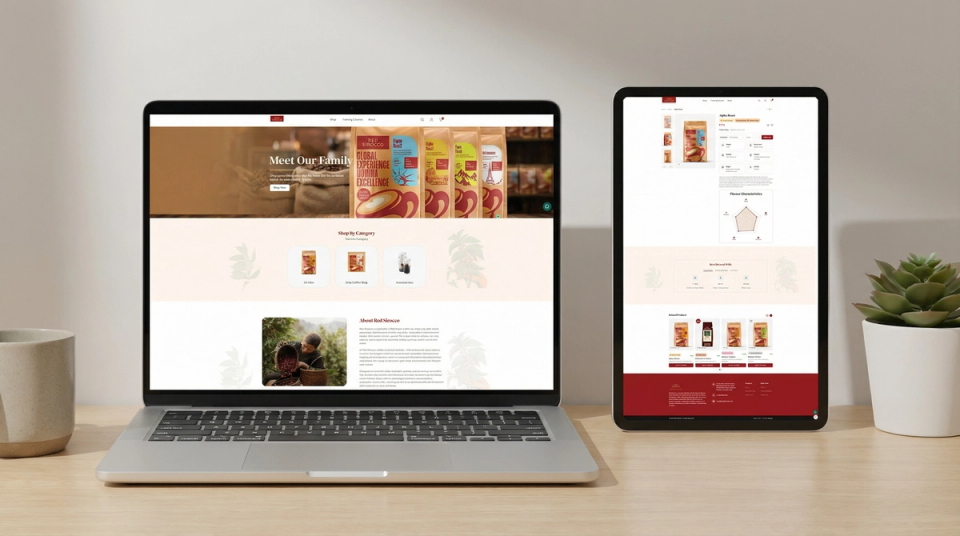
A basic WooCommerce store rebuilt with structured product pages, conversion-focused UI, and a mobile-first layout — taken from redesign to full live deployment.

100%
Store Rebuilt & Live
3x
Product Page Structure Improved
+65%
Mobile Usability Score
+48%
Browsing Engagement Uplift
Red Sirocco screenshotRed Sirocco screenshot

The Challenge

The Red Sirroco store was live but not built to sell. Weak structure, poor visual hierarchy, and an unoptimised browsing experience were limiting customer confidence and keeping engagement low.

UI & Layout Issues

  • Basic card-style layout with no visual differentiation between products
  • Product pages were minimal — key buying information was not surfaced clearly
  • No visual hierarchy to guide users toward a purchase decision
  • Store design did not reflect a credible, conversion-ready brand

Navigation Problems

  • Category structure was flat with no guided browsing flow
  • User journey from landing to product was not optimised
  • Weak product discovery experience across the catalogue

Mobile Experience Issues

  • Layout was not designed for mobile-first interaction
  • Conversion elements were difficult to locate on smaller screens
  • Touch targets and spacing not optimised for thumb navigation

Our Approach

The store was rebuilt from scratch — UI, product architecture, and user journey — with conversion readiness as the primary objective at every stage of the build.

UX & Design Rebuild

  • Completely redesigned the full store UI/UX from scratch
  • Created a modern visual hierarchy with stronger layout structure
  • Improved product visibility and presentation across all pages
  • Developed a consistent design language aligned with the brand

Product Page Optimisation

  • Rebuilt product detail page layout with clear information structure
  • Surfaced key buying information — specs, trust signals, product context
  • Improved add-to-cart visibility and reduced friction in the purchase flow
  • Designed custom conversion-focused product cards for the archive pages

Performance & Responsiveness

  • Implemented mobile-first responsive design across all store components
  • Optimised navigation flow and category structure for intuitive browsing
  • Improved overall store performance for faster, smoother page loading
  • Took the full project from redesign phase through to live deployment

The Results

The rebuilt store delivered a materially stronger shopping experience. Product presentation improved across every touchpoint and the store is now structured and stable enough to support active marketing spend.

User Experience Improvements

  • Cleaner, more confident product browsing flow throughout the store
  • Better product discovery with improved category and navigation structure
  • Reduced user friction from landing through to the checkout stage
  • Stronger first impression — store now reflects a credible brand experience

Conversion Readiness

  • Store is fully conversion-ready and prepared for paid traffic
  • Stronger product page structure increases buyer confidence at key decision points
  • Improved mobile experience supports performance across all device types
  • Full live deployment completed — store is active and marketing-ready
Back to case studies Start a project with us →