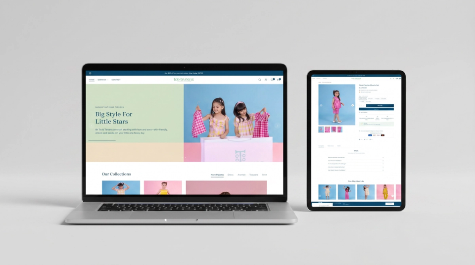

A premium kidswear Shopify store redesigned for clarity — improved collection structure, stronger product presentation, and a mobile-first layout built to match the brand's comfort-first positioning.
Tot and Tweens had a well-defined product range and a clear brand identity, but the storefront was not presenting either effectively. Collection structure was flat, product pages lacked visual hierarchy, and the mobile experience needed significant refinement.
Store Layout Limitations
Navigation Issues
Mobile Experience Gaps
We restructured the full Shopify store experience — from homepage through to product pages — with a focus on cleaner collection architecture, stronger product presentation, and a mobile-first browsing experience suited to a premium kidswear brand.
Homepage Redesign
Collection & Product Optimisation
Mobile & UX Improvements
The redesigned store delivered a noticeably stronger shopping experience — cleaner collection browsing, better product presentation, and a mobile layout that now matches how parents actually shop for their children's clothing.
User Experience Improvements
Store Performance Impact
Let's Talk
Quick details and we'll reach out. No pitch — just an honest conversation.